Music to your Ears
Eric, Julian, and Vinay
Background and Motivation
Spotify Wrapped has quickly become one of the most obsessed, loved, and boasted products of all time. In fact, it is one of the biggest differences that allow Spotify to stand above other music streaming platforms such as Apple Music and Amazon Music. People enjoy seeing their monthly top artists, how their music has evolved through time, and compare statistics on who is the more dedicated Swift-y or BTS stan.
Thus, stream tracking has become increasingly popular. Recipify, a web app that shows the top streamed songs a person has listened to in the last month, skyrocketed in popularity during 2020. Last.fm, another web application that allows users to connect their Spotify to get more information about their past weekly streams with “Weekly Reports”, has also gotten increasingly more popular over the pandemic. Whether it is the mix of the pandemic forcing people to stay home and try to find their own music to listen to or just data tracking becoming more powerful during recent years, the demand of compressing your daily/weekly/monthly/yearly music streams into compressible and easily comprehensible information is high.
In our team, all of our members have a high interest in music. The Spotify API allows us to easily connect a user with their Spotify account and extract data about previous streams, playlists created, and searches that they had performed. This can be used to create visualizations that inform the user about their listening habits.
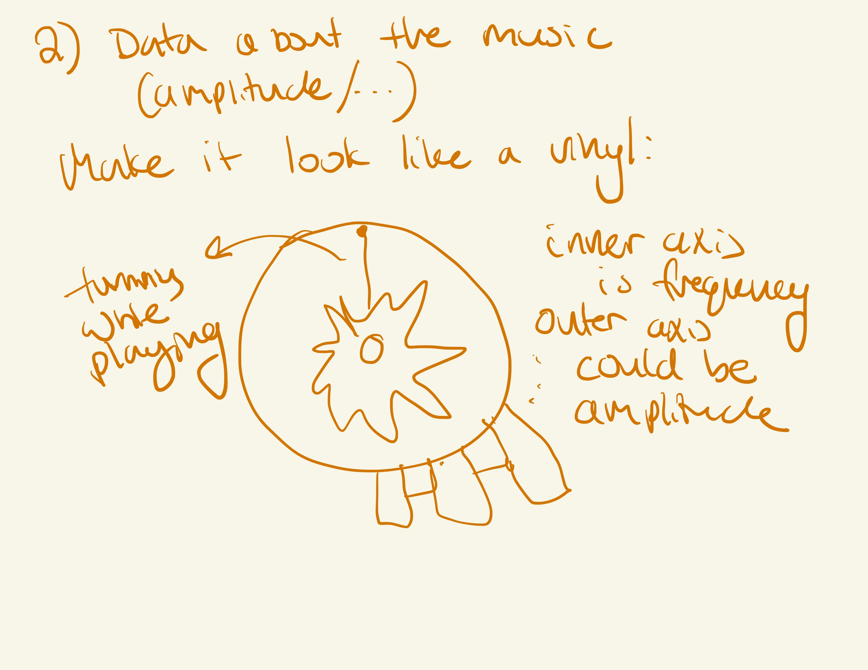
The song data also provides a lot of room to do interesting work. We have access to the data representing the song itself, which can be processed and turned into an amplitude graph in the frequency domain.
Edit: We have switched from the Spotify API to using the LastFm api as it allows us to gather data about a particular user from just their username. LastFM is a music service that allows users to create an account and link their already existing music services like Spotify, Tidal, or SoundCloud. Then, LastFm tracks each user's habits and accumulates them into an API which can be accessed very easily. With this service, it makes our visualization desires much more feasible.
Project Objectives
The goal of our project will be to provide a summarization of user data, and to be able to visualize individual songs through a unique spectrogram-style visualization. We will be learning how to process song data, use the lastFM API, and how to build a complex web visualization using best practices. Our focus is to make it an experience for the user rather than just interactivity, we want to guide the user to how they can view their data differently.
Must Have Features
- A way for users to be dynamically connected based on their personal username
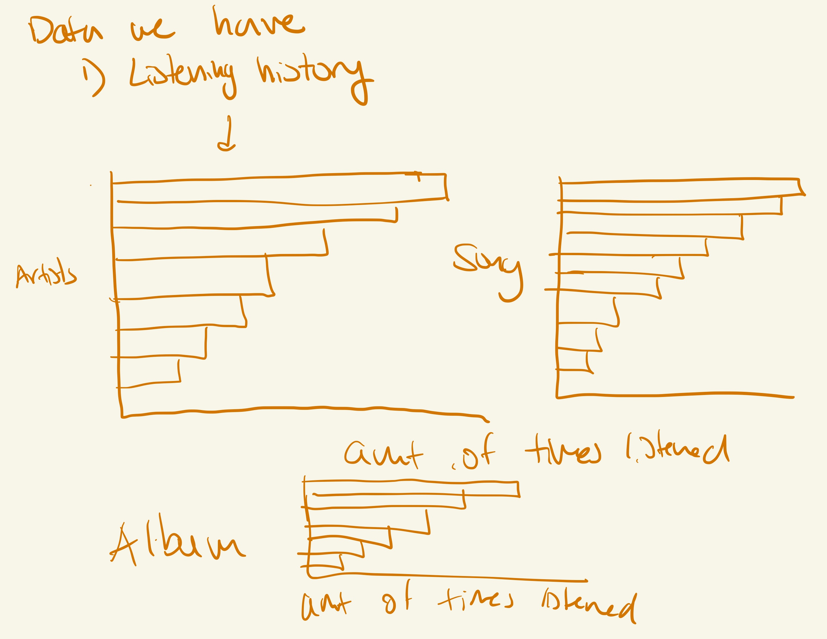
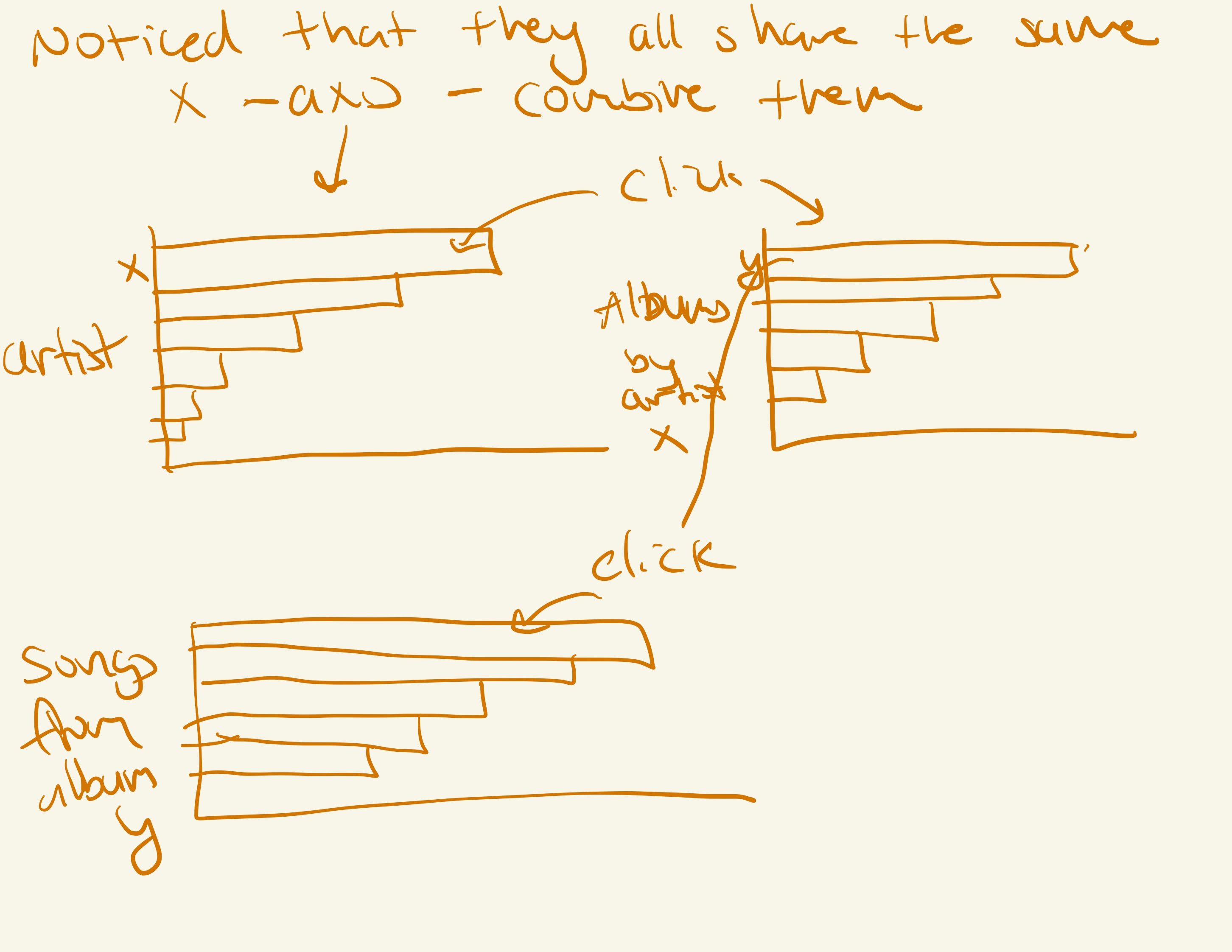
- At least 3 visualizations summarizing the user's listening data and trends inside of an interesting way. One focuses on artists, one focuses on tracks, and one focuses on albums.
- Way to choose a particular song to analyze it's amplitude. This should be incorporated into the visualization.
- Component Design Approach to visualizations
- Minimalist styling that mirrors Spotify Wrapped
Project Schedule
Oct 31 - - Complete project proposal Project proposal (due Oct 31)
Nov 6 - - Authenticate with Spotify API and extract to good formatted data (Vinay), use dummy data to create basic visualizations (Eric), extract data from a given mp3 file and create basic visualization (Julian). Add to the process book along the way.
Nov 13 - - Combine all different aspects together. Finish up the process book. Milestone I - a functional project prototype (due Nov 14)
Nov 20 - Sharpen and finalize visualizations that want to be presented. Split each visualization per person (Vinay, Eric, Julian).
Nov 27 - Combine the visualizations on a single dashboard and create slides for presentation with written script. Complete screencastify demo with the final visualization. Milestone II - a fully functional prototype (due Nov 28) In-class user studies (Nov 29)
Dec 4 - Have script written to allow for practice Final project presentation (Dec 1 + 6 )
Dec 11 - Complete peer evaluation and finish up submission
Dec 18 - Complete peer evaluation and finish up submission Final project submission + peer evaluations (due Dec 19)
Related work
We based a lot of our ideas and inspiration from the already existing end of year recaps that many companies provide. Some examples include ones from Spotify (Spotify wrapped), and even Apple Music. We like these recaps as it allows users to look back at their year and see some trends or information about their listening habits. We wanted to create something like this as as visualization website users can look at on their laptop. Also we want to allow users to be able to look up their friends accounts as well and see their habits.
Some Inspiration:
Questions
Some questions we are trying to answer are:
- What is the best way to visualize song listening trends?
- How can we best visualize an mp3 file?
Data
We will be collecting data using a user's LastFM username. Once a user inputs their username, we are able to look up and receive data about their listening habits and trends fro the LastFM api. This API provides us information about the user, recent tracks they listened to, an overall history of the user, and many more interesting data tidbits we can use to help build our visualization.
We will be collecting this data by submitting multiple API requests based on the data that we want to collect for that particular visualization.
Link to LastFM API: https://www.last.fm/api
Data Analysis
We will be finding some library to process raw audio data (e.g. MP3), and convert it into some format which is useful for our visualization. E.g. break down MP3 into a time-dependent amplitude function in the frequency domain. We can filter the results to include frequencies in the human-audible range, and then bucket / quantize this so it can be easily visualized.
Visualization Design
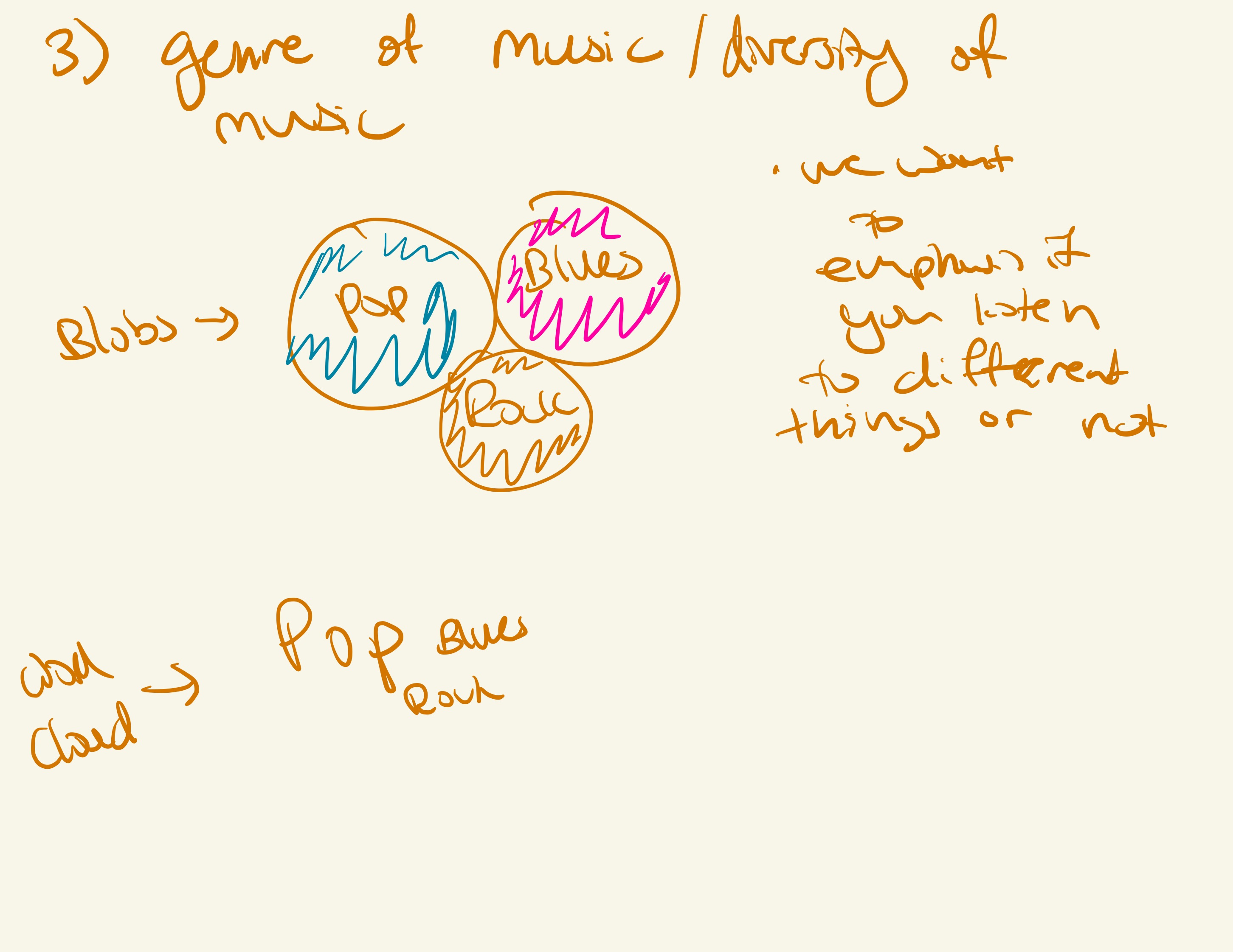
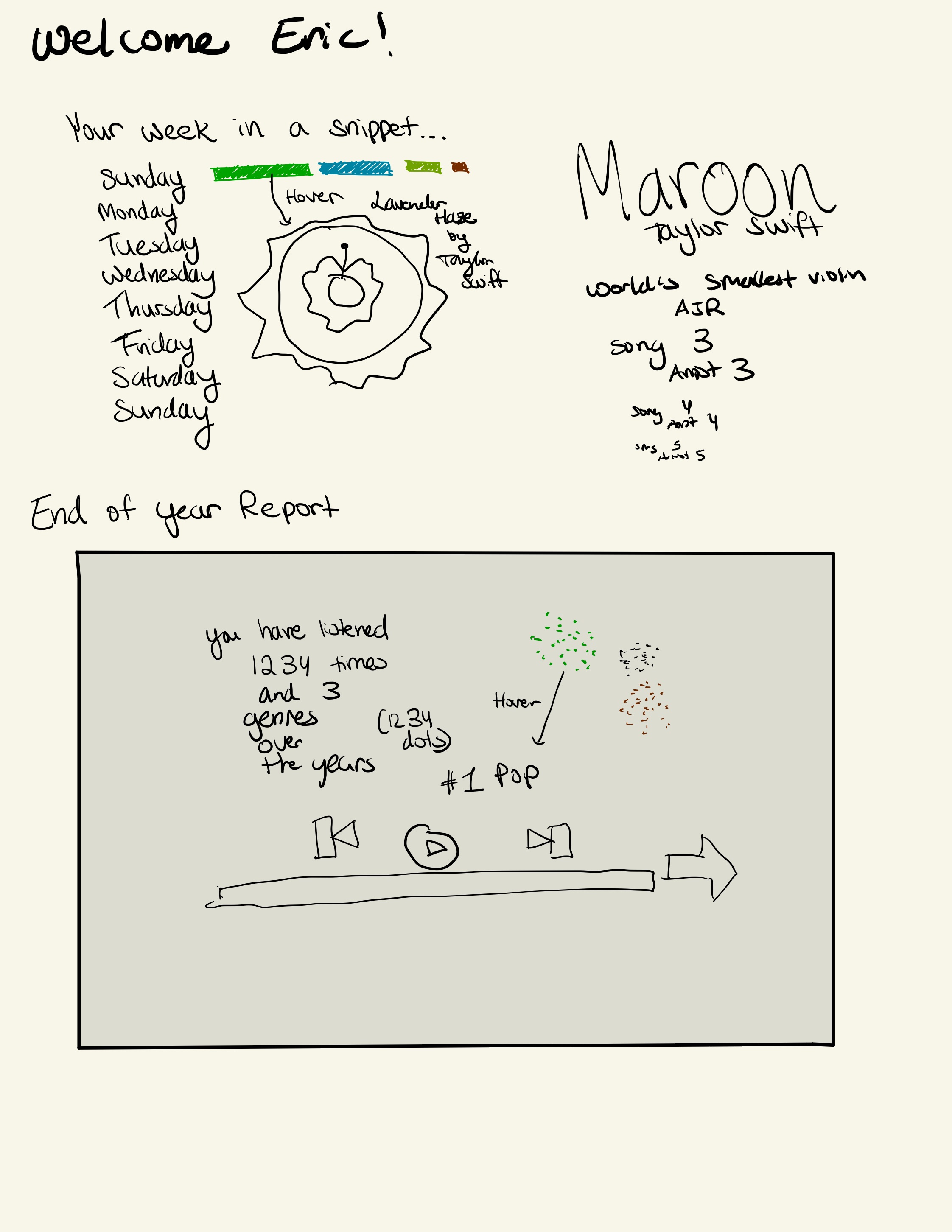
Brainstorm and Initial Designs
Realization Design
Final Design
Update: We are using the Web Audio API to process MP3s (And other audio formats). This provides convenient functions to bucket different frequencies' amplitudes.
Exploratory Data Analysis
While debugging the mp3 visualization, larger buckets and lower polling frequencies were used to understand the formatting of the decomposed audio data. Once we were sure that the data was being processed properly, we were able to bring the visualization closer to production standard.
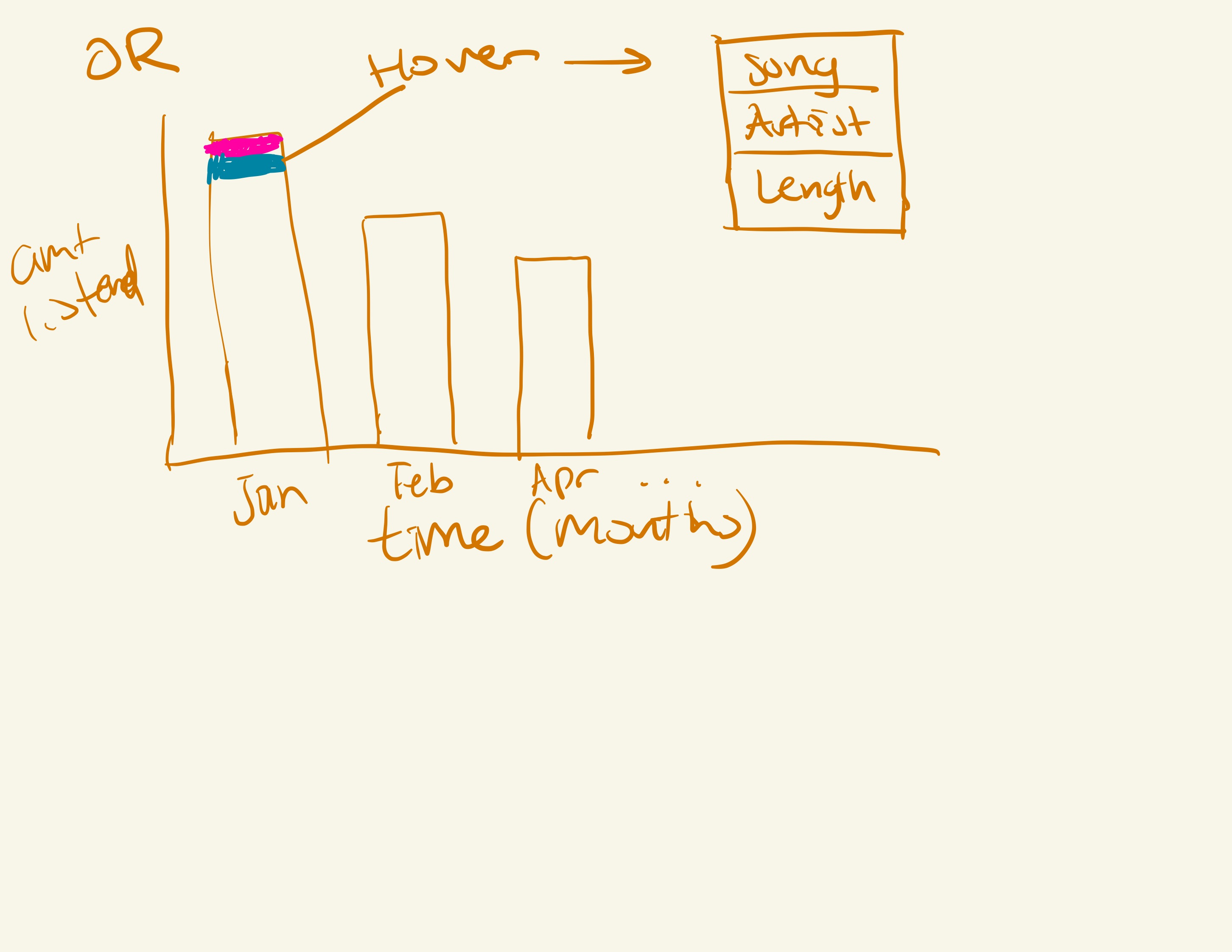
When creating the different charts to show song history like the Violin plot and the album collage, we found that more hover information works the best as it allows users to visually get more information as to what they are seeing. Additionally, adding more explanatory content in general we found is always better as it gives a clearer picture as to what the user is looking at.

This had the cleanest layout and was simple to use. This was also extensible as it allows us to add more visualizations on different pages depending on what page the user is on. It allows us to hid the next visualization behind a button so the interface is kept looking clean and modern. We use a lot of ink to just show the data, and we don't clutter the screen showing unnecessary lines and values. Additionally, we use color to help make the values that matter pop out. This allows us to show the user only what matters. We also use animation to help show the user what has changed in terms of the progress bar, and the animations in the mp3 vis as well.
M1 Update
We began our process with vanilla JavaScript and created multiple visualizations using JS and mainly leveraging the d3 framework. From our own rubric and goals we wanted to eventually move into a NextJS component design but for now, we created a baseline skeleton design for possible graphs.
Below shows our visualizations that we created to show basic information about the user following a model dataset that we created
In this process, we also found that using the Spotify API was going to be limiting since we did not have the ability to get year long data on users. We had come up with using the last.fm api to gather the data instead since it was more inline with the goals of our project to show users about their information. Additionally, the API is easier to use and the users from the API are curated users that want to have visualizations and fun ways to express their music taste. That is why they would sign up to use the app in the first place
We were still going to follow mainly the same ideas as the Spotify Wrapped had but also we now had additional inspiration from the api since it gave us more resources to find specific artists, tracks, and other info about listening habits.
To be honest, I found our original bars very boring and the dots laid out way to generically to be interesting to users who enjoyed artists so we began brainstorming again on how to layout our data and that turned into what we did for our final design. We also decided to drop genre since the last.fm API did not directly provide that (we would have to through a multitude of steps to get the genre of a song)
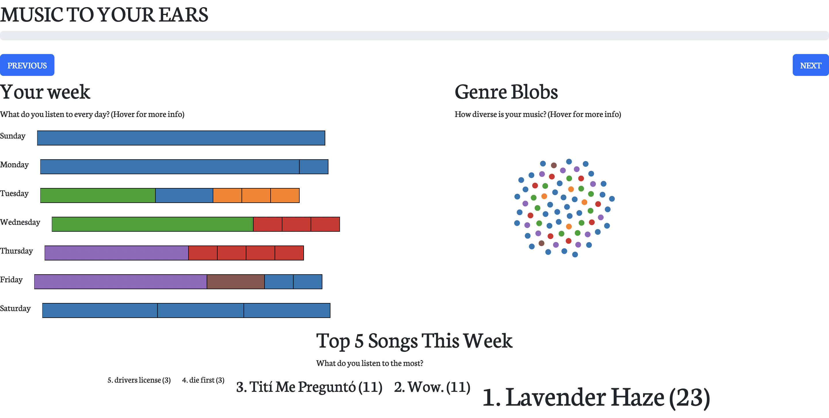
Updated Website Template
Our Website TemplateM2 Update
We began to follow more of the website template and began to move towards NextJS. In order to get information from our API, we realized that images were not included inside of our api data endpoint and having to fetch tons of images one at a time to a RestAPI is inefficient. Thus, we used prisma, PlanetScale, mysql to store the images and more information. This will help prevent spamming and being banned from the API
Another issue that we ran into we combining our code since we wrote our code in both tsx and vanilla js forms. When combining, I had to convert a lot of prototype Javascript into typescript classes in order to be importable and be mindful of next.js's state management system. We were able to resolve this but the recommendation visualization ended up not being added into the deployment due to these issues. We were fine with this since we already had enough visualizations to be displayed in our deployment
We also wanted to emphasis the idea of interactivity since that is what Spotify wrapped is all about. We added multiple keyframe animations to make the process seem like an actual interactive experience where users would be excited to see what comes next and learn more about their data
We also emphasized bit-sized info and shareability. This is key in our breakdowns in the text as well as the last summary where we allow users to just compress their data. Additionally, I think it is very cool that we can save the 5x5 collage visualization that the user created with their personal data.
Visualization Design Evolution and Implementation
Our visualization designs did not change much. In fact, we only added more hover information and explanatory content between user testing as the users we tested our designs on found that our visualizations themselves looked clean and usable. From our proposal to our final design, we looked at which design would make the most sense and offer the user the best experience. We ended going with something like the following
Final design
Below are some pictures of our final design:
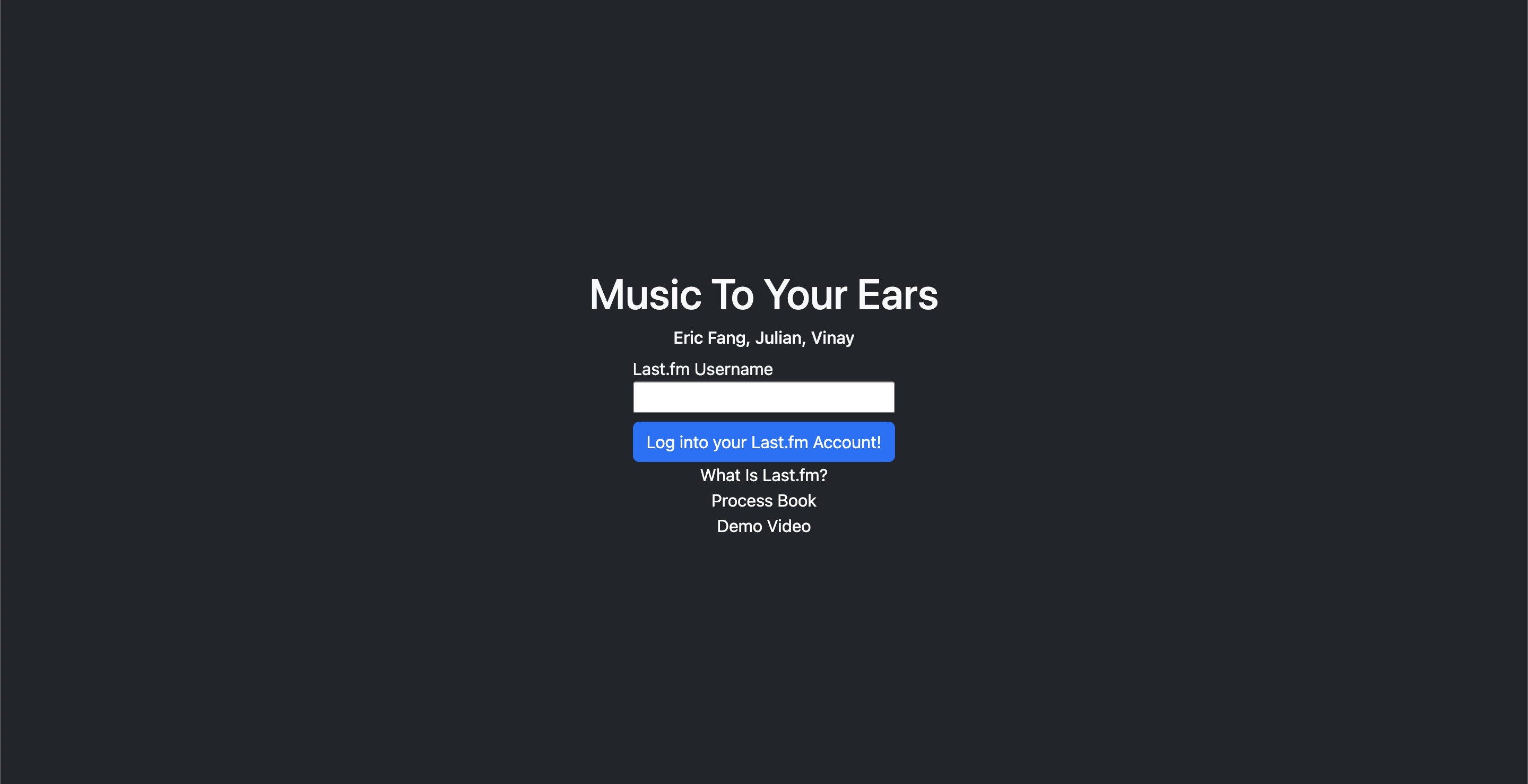
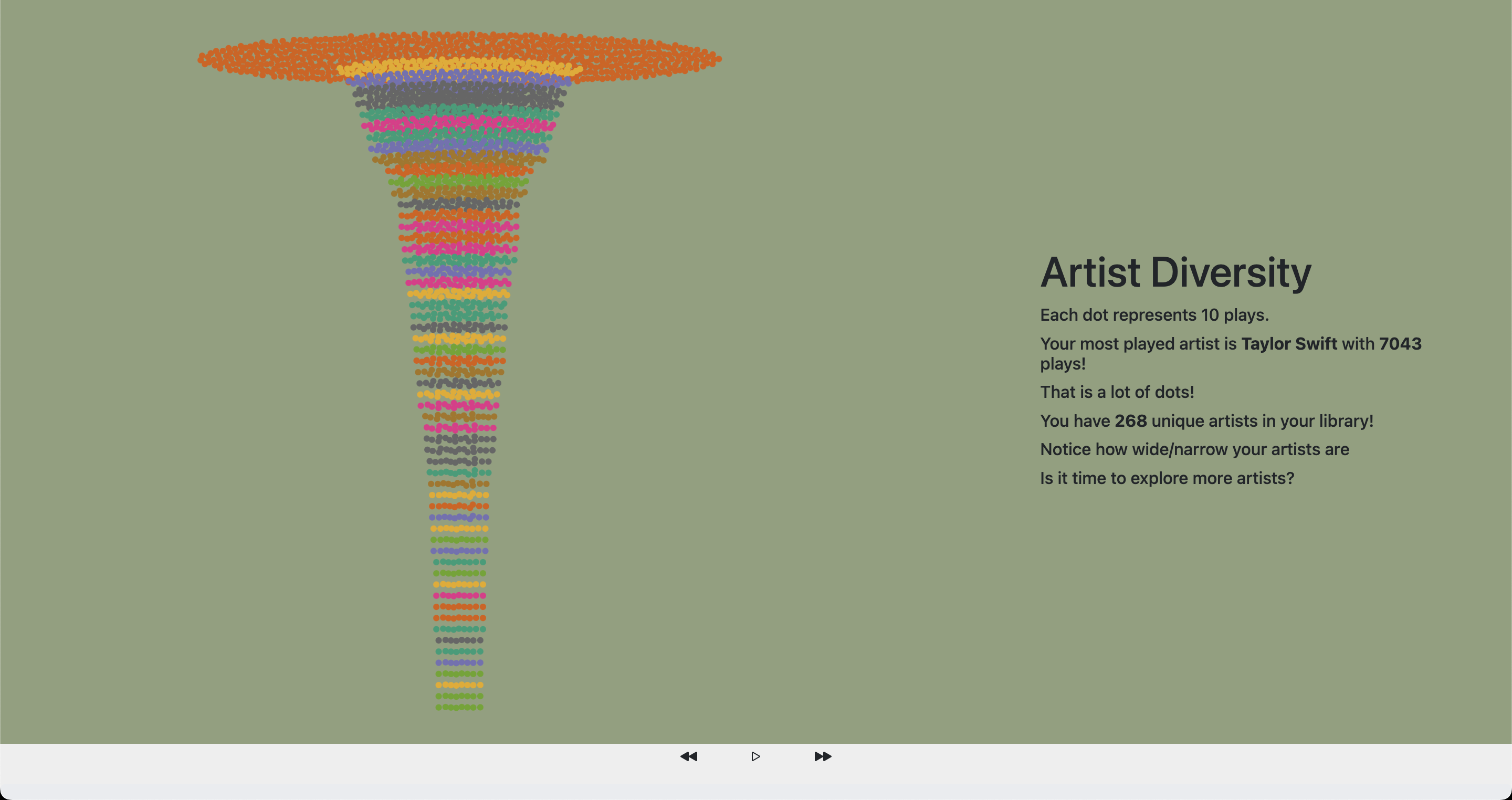
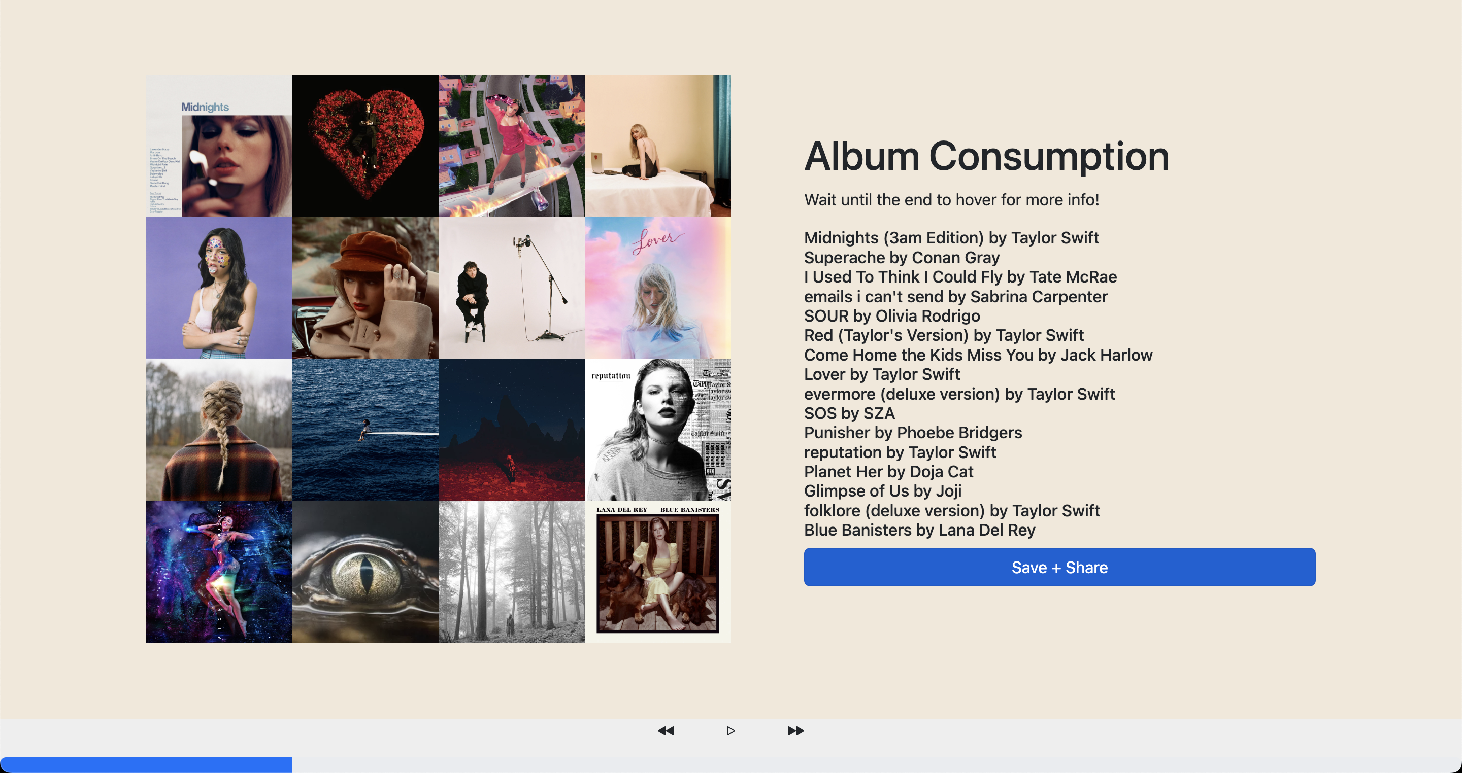
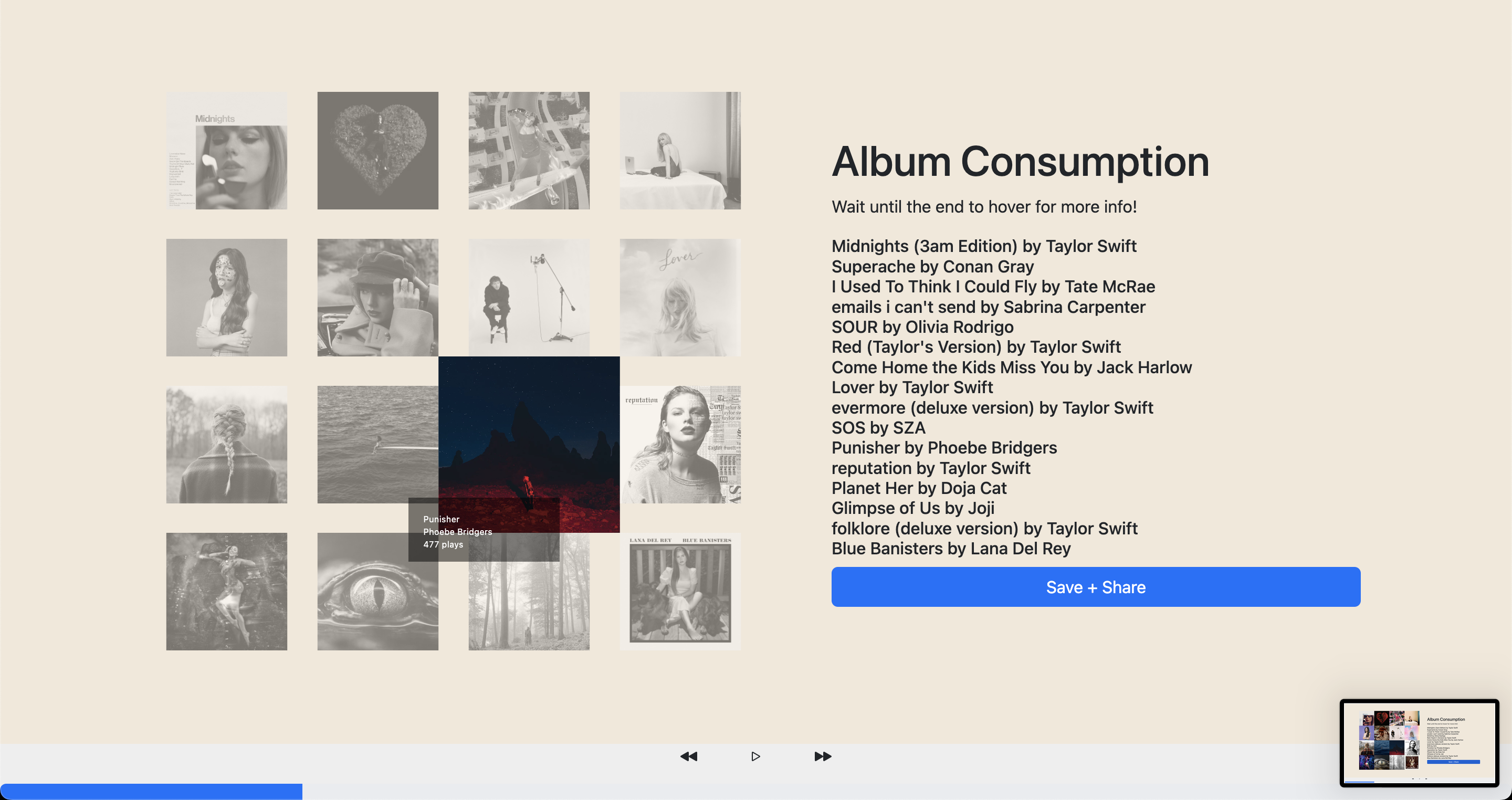
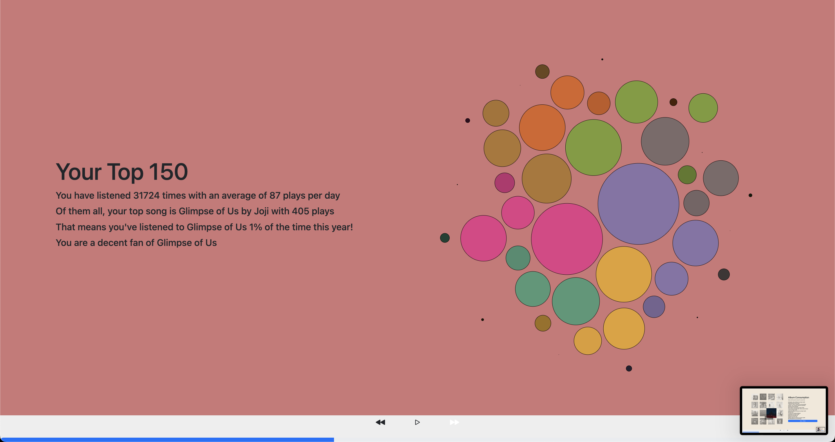
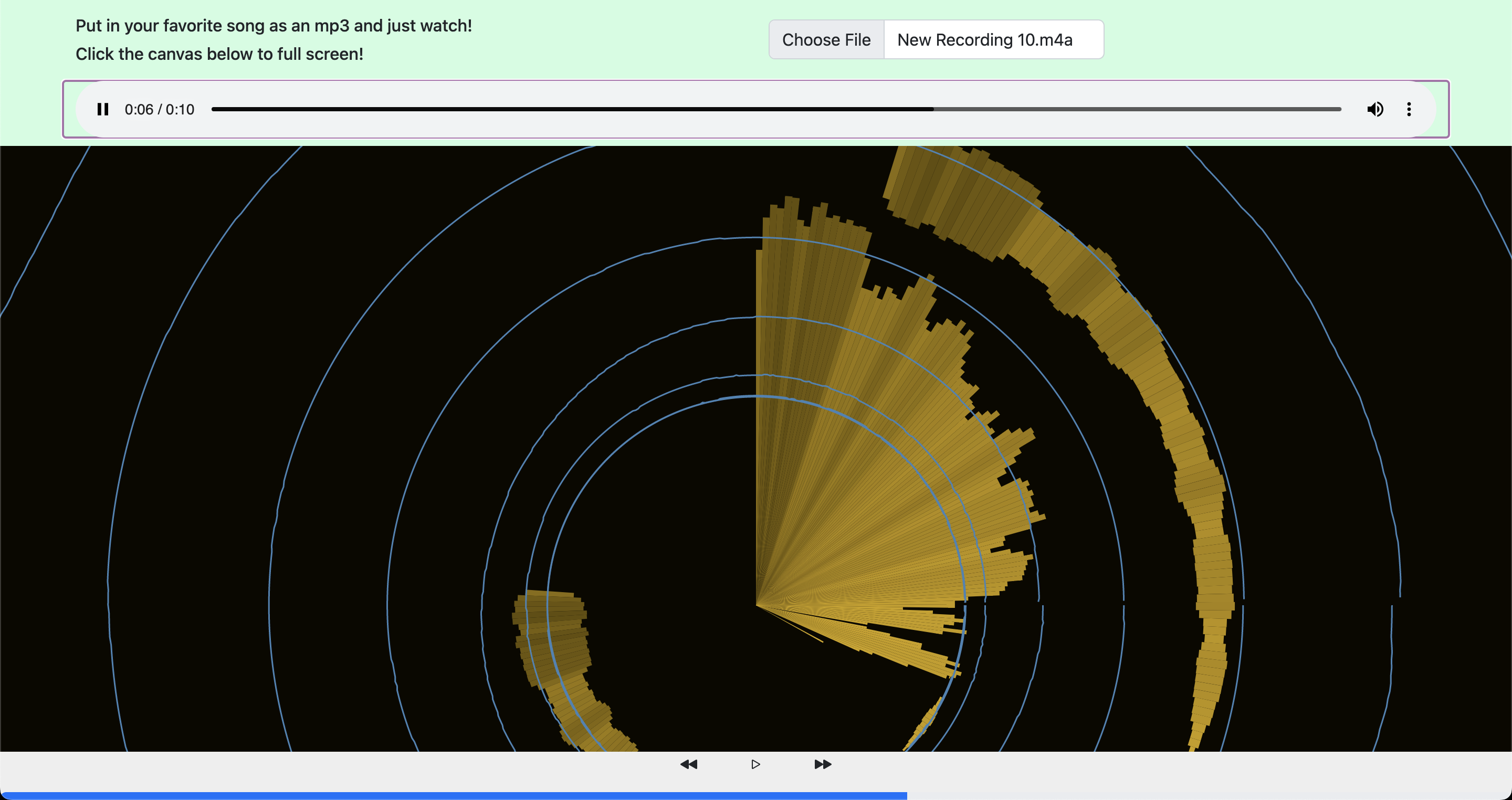
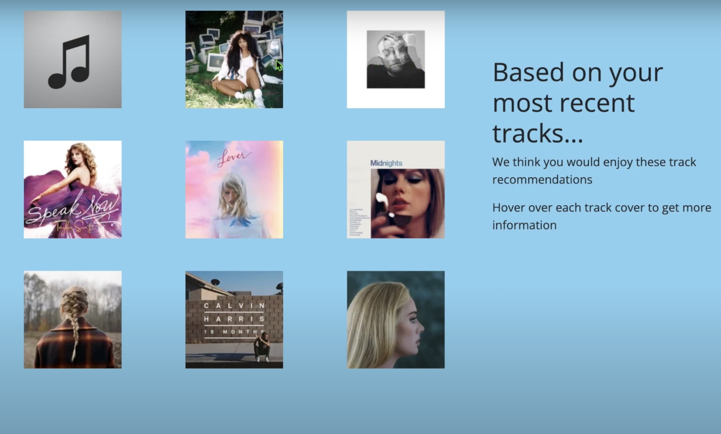
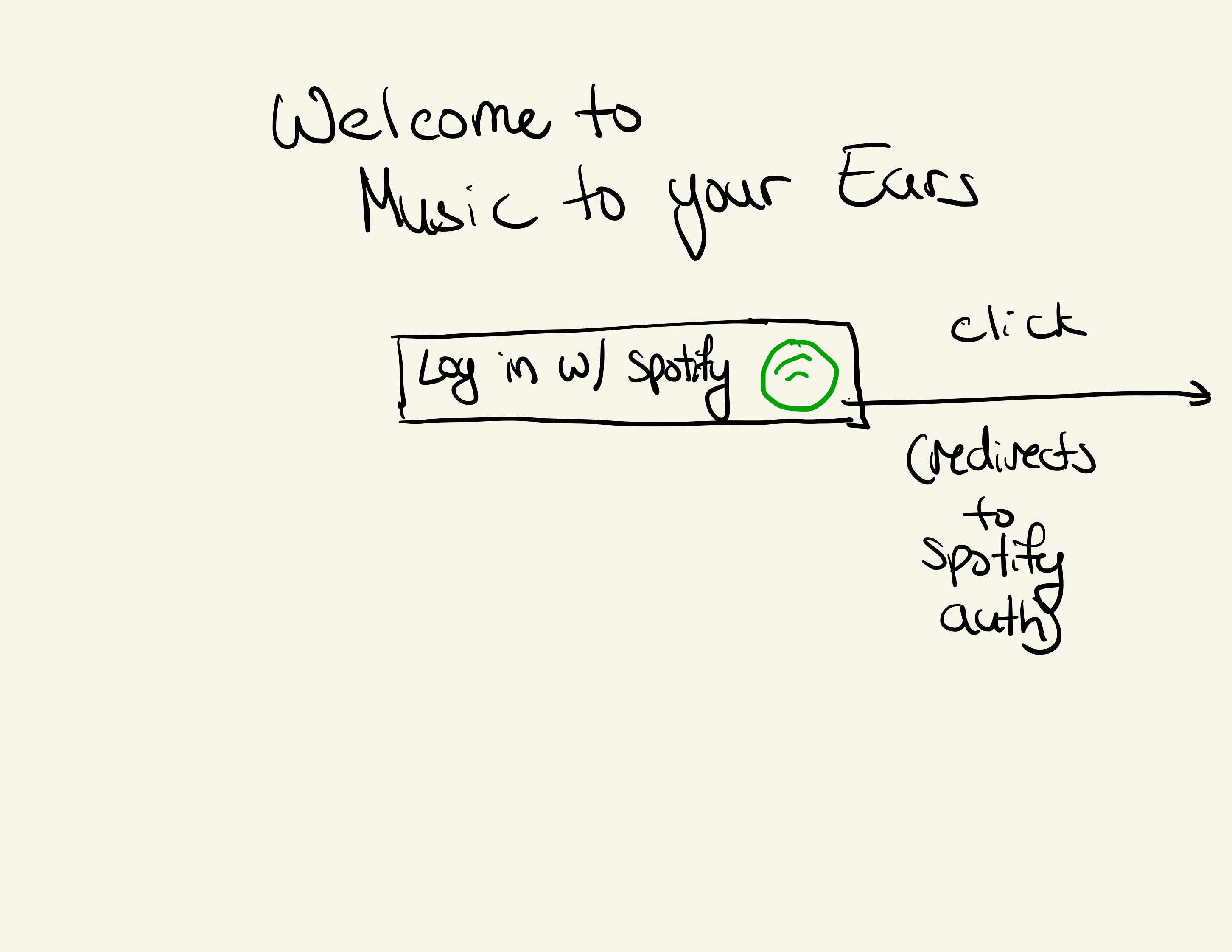
To explain a little bit about our design, we can look through the few components in each. First, we bring every user to a log in page that has information about our site, and a place to input their LastFM username. This will allow our site to pull data for that user and actually visualize their listening trends. Also on this page are buttons to learn more about LastFM, and our process book
Next, while we are pulling all data from the api we need to load the page so we have a small loading screen that explains what's to come to the user. This was very much inspired by Spotify Wrapped to build momentum to their experience. Then, the main section of information is the visualizations themselves. Each visualization comes separate on a standalone page that features the visualization, some explanatory content, and then a progress bar on the bottom.
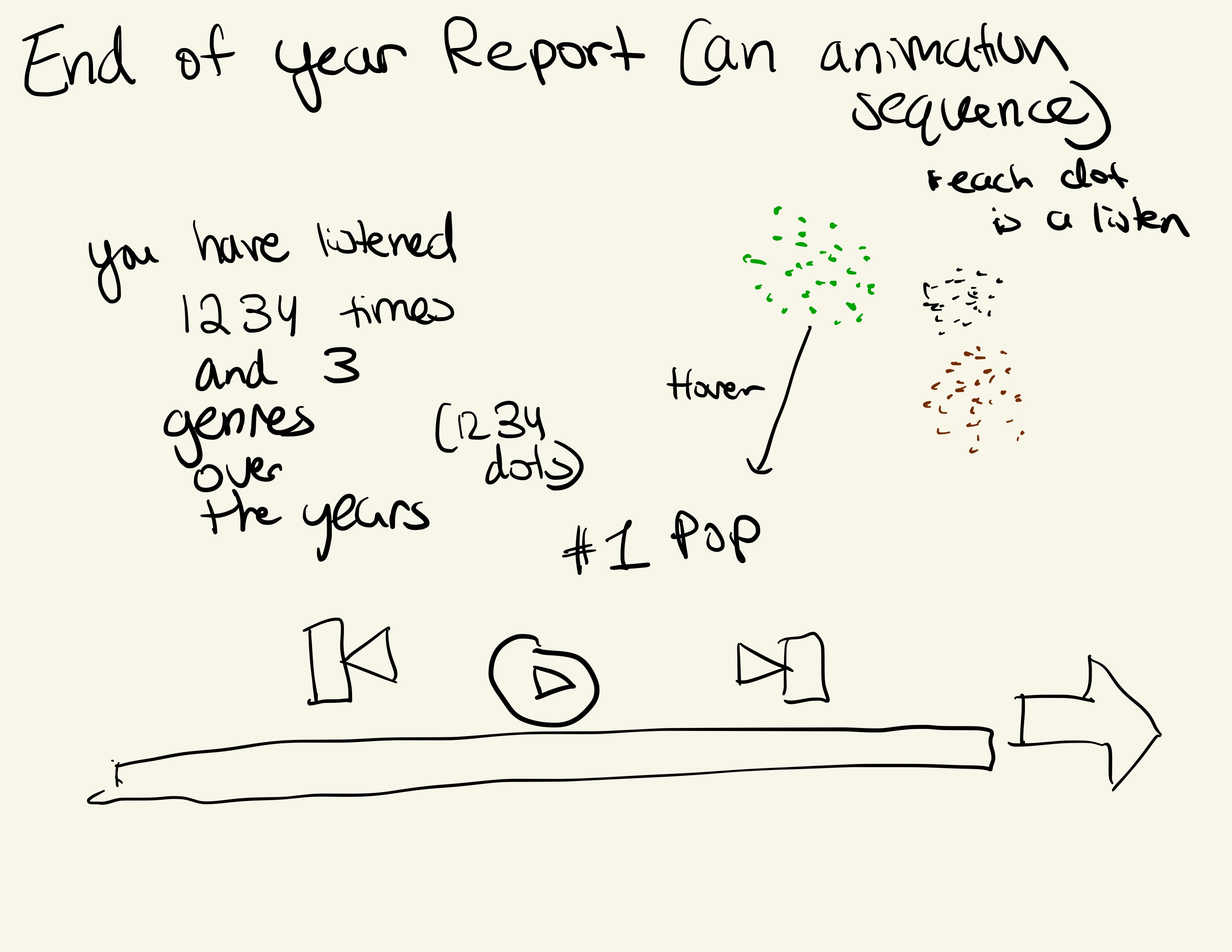
The first visualization is a pseudo-violin plot showing how many times you have played songs by that particular artist. Each dot represents 10 plays. We wanted to emphasis the idea of artist diversity or not. As mentioned in our motivation, by having less diversity and being a strong fan of a particular artist, you are able to share how much of a fan you are to your friends while having a fanned out graph shows that you are a more diverse listener. Since the dots are made with d3.js, it is easy to add interactivity to the dots. Thus, users can hover over it to see who the artist is and even more the groups of dots around.
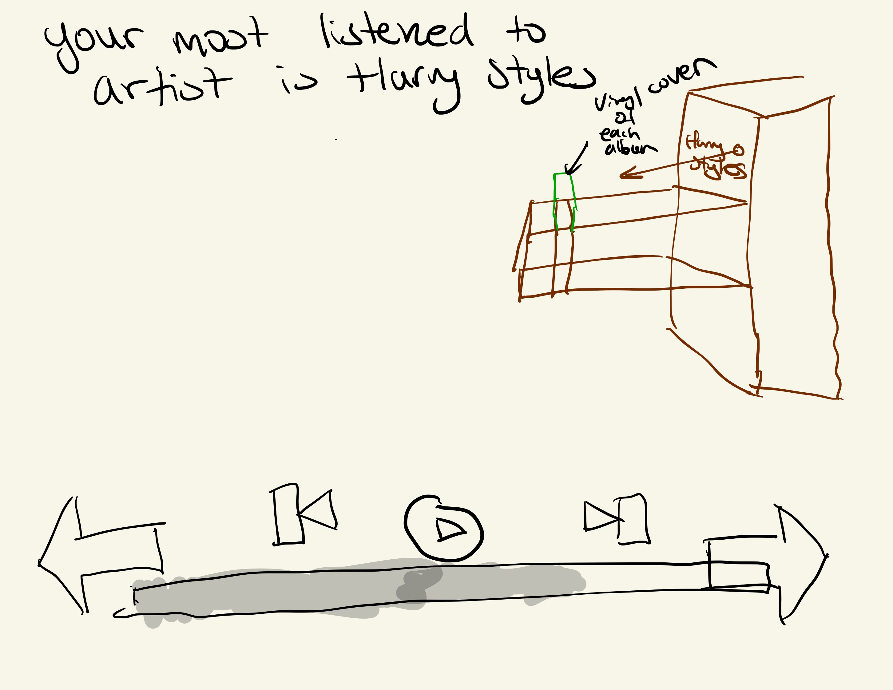
Next visualization are the albums you have most frequently listened to. It is a 5x5 collage of the artist albums. We believe that album art is one of the most important parts for an artist to show their personality and style. We wanted to show this to the user and allow them to see their favorite albums in a collage. Additionally, it does look very pretty as the art is all different and the user can see their favorite albums in a nice way. Having the albums show up through a cascading fade is also intentional in having their get their data one at a time and having each album have their own moment and reflective time for the user. The additional interactivity of hovering gives users additional info and plays along even more with the overall interaction of the site.
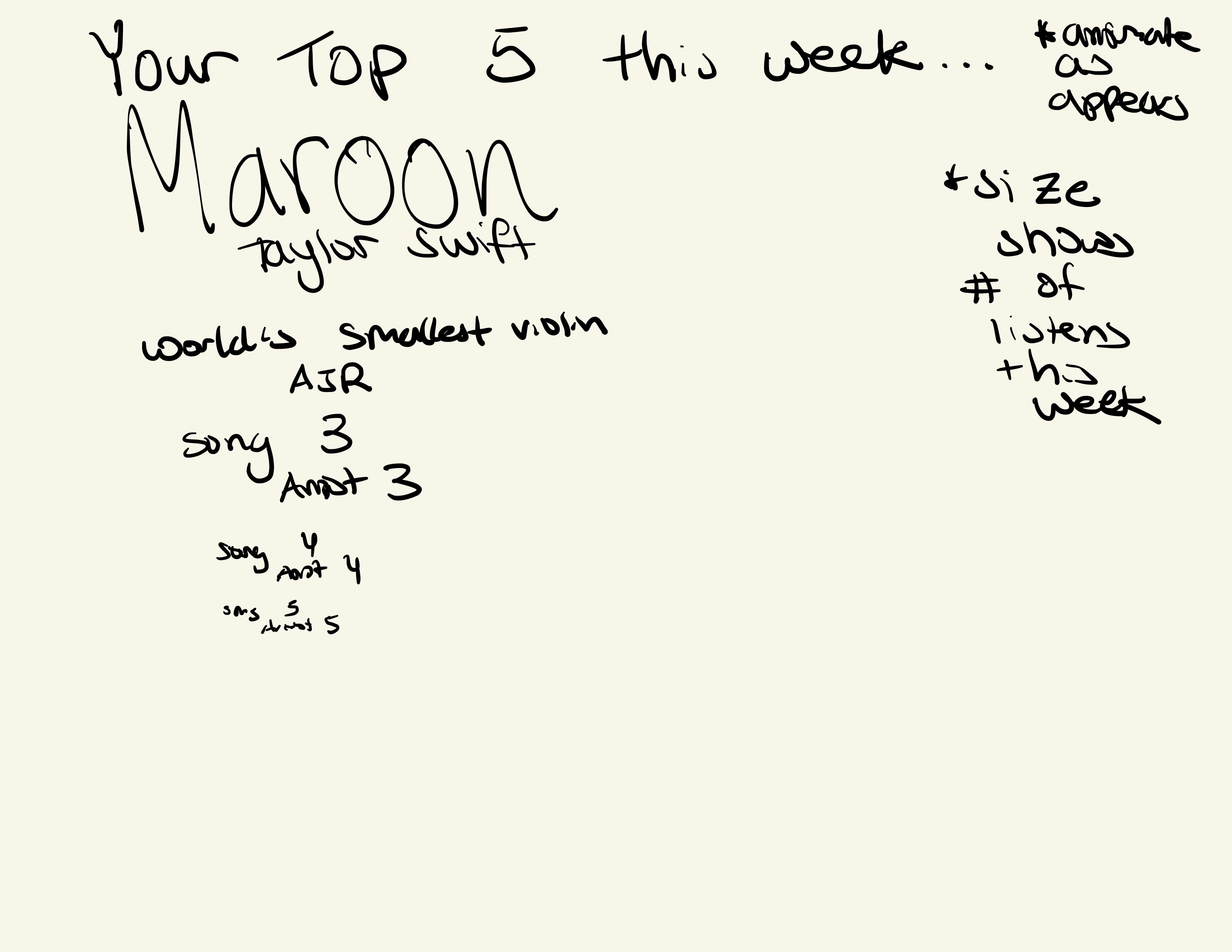
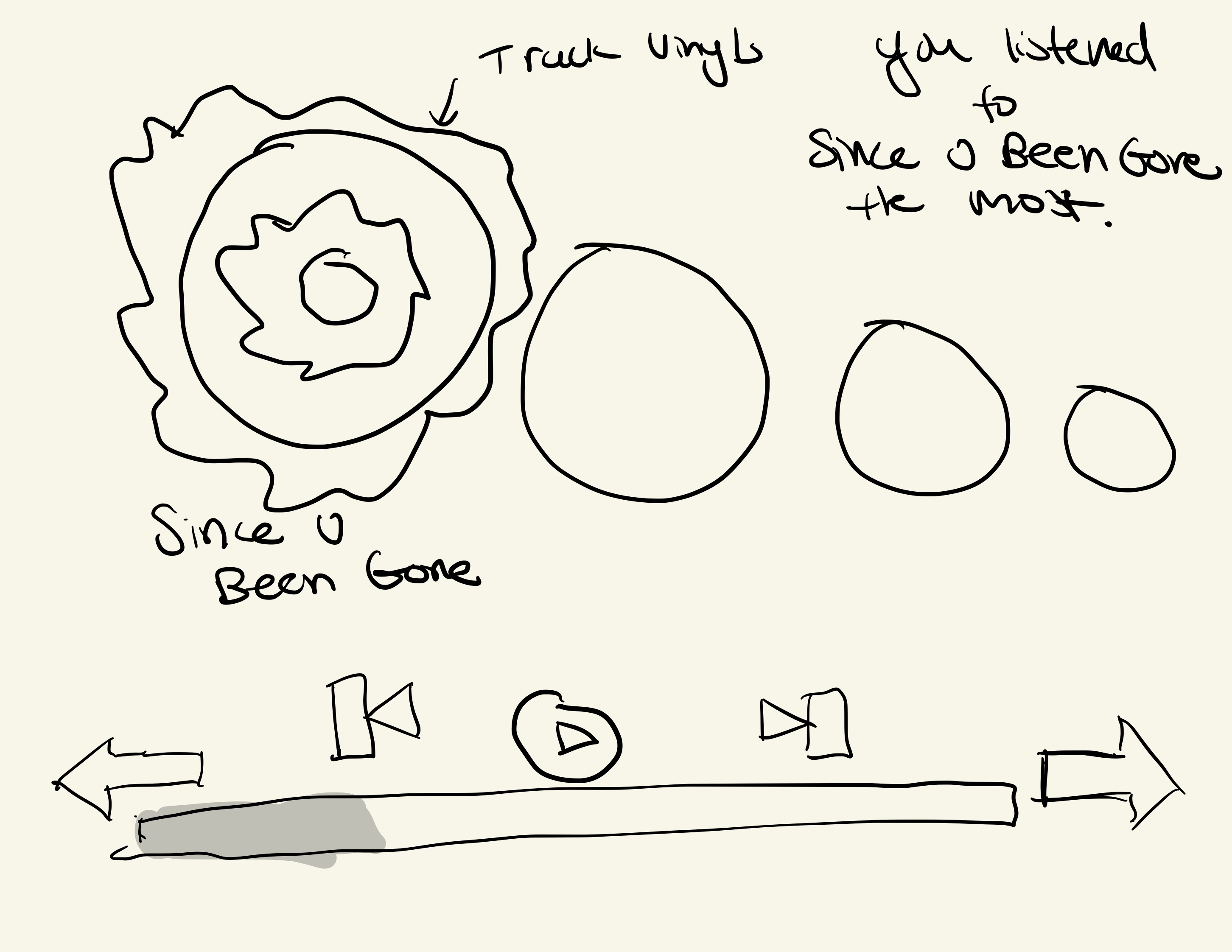
The next vis is showing the top 150 songs for each user. We chose to use a different animation to show the dots coming in. Like the albums, the dots come in one at a time in a very visually appealing way. The stats are dynamic and give a descriptor of their top song depending on the number of plays. The user can hover over the dots to see the song name, artist, and number of plays.
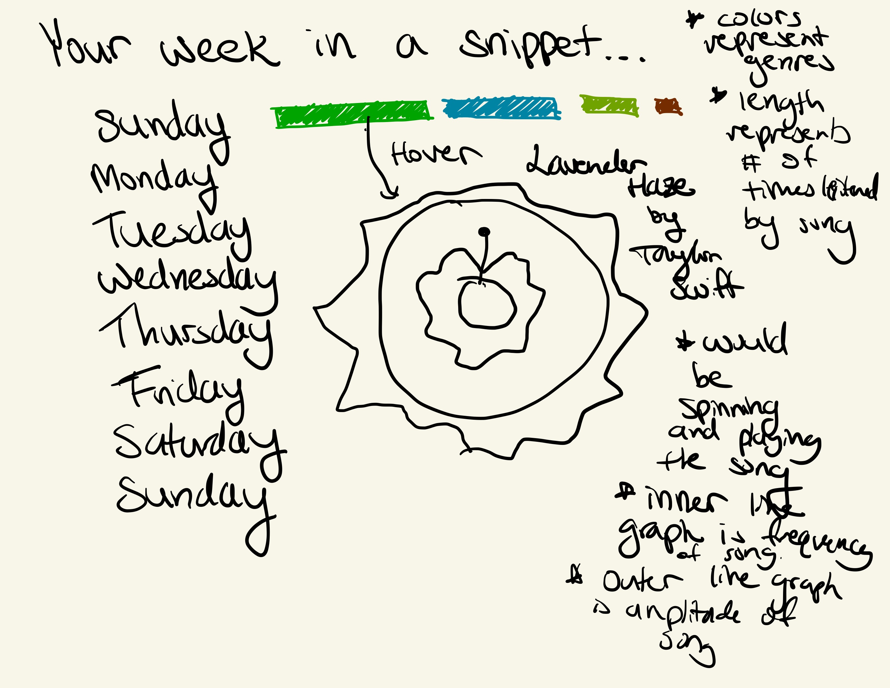
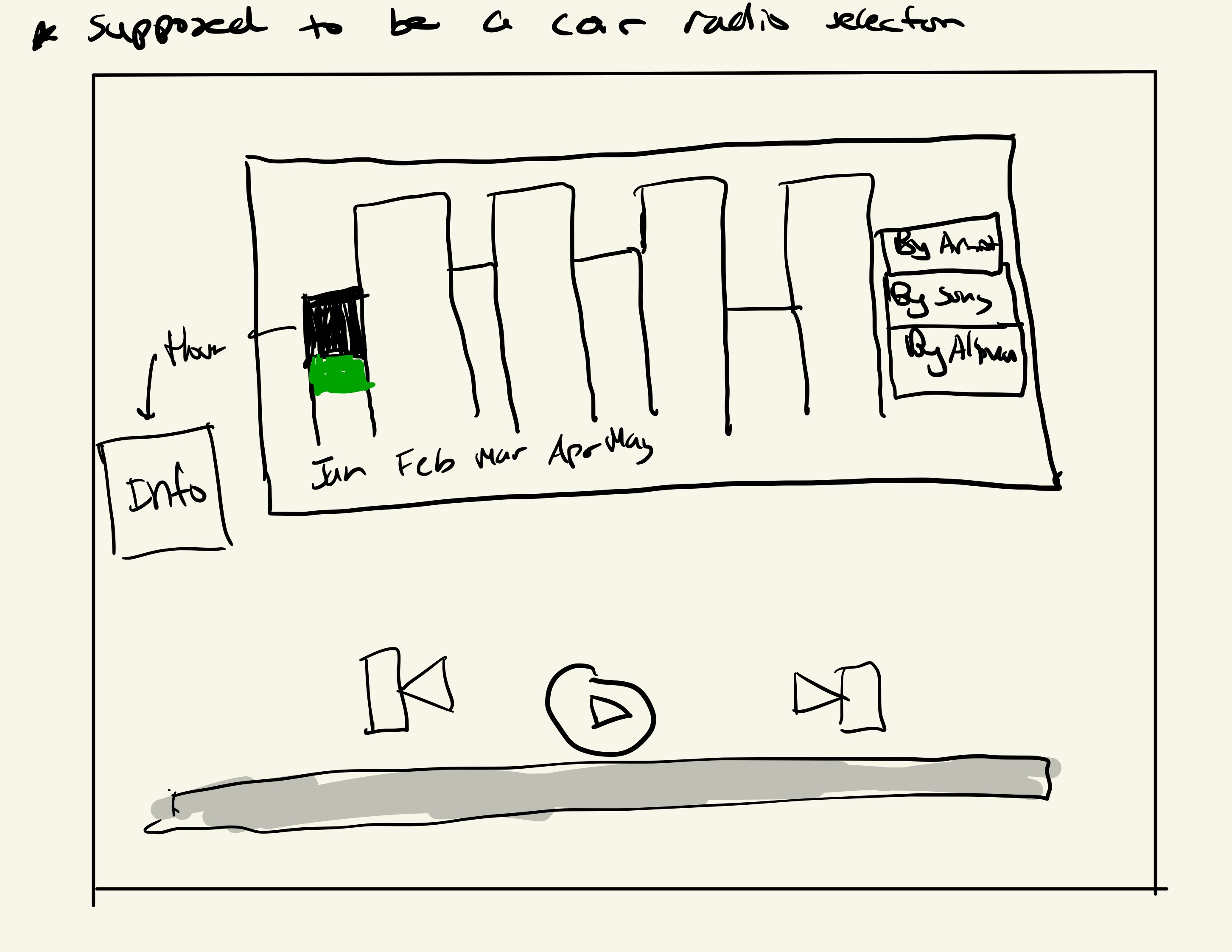
The next vis is a mp3 visualizer that shows waveforms and amplitudes for any uploaded mp3 file. This visualization shows the amplitude and does math on the song length and volumes in order to display three different types of lines. The color oscillation moved the background color and changed the colors of the outer and middle lines to add an immersive effect. The main purpose as stated originally is to be able to give users more insight about their particular song that they chose. We feel that we were able to accomplish this since we can clearly see the difference of the waves if you listened between songs and genres and users can compare them by swapping their mp3s. At a rate of 30 Hz, the time data and frequency data are updated. Each time this happens, all vis components are updated. The three middle components are all variations of the frequency data. For the two that spin, their angular velocity is a function of the mean frequency band magnitude (MFBM). Also when a certain threshold is passed for the MFBM, all three of these will also expand outwards. The components that continuously grow outwards are time data traces. I store the most recent traces in a buffer and continuously multiply their radii. Finally, the back ground brightness is also a function of the MFBM.
There is also a vis that shows recommended tracks for each user based on their most recent tracks. This is a vis that shows the recommended tracks in a list. The user can hover over the tracks to see the artist and song name.
The last visualization is a recap visualization that compresses the multitude of information that the user went through. The background is oscillating gradient in color to give a more finale type of feel for the user and the layout is very much inspired by the Spotify wrapped sharing layout.
One component that is prominently features throughout every page is the progress bar. This progress bar is made to look like a mp3 app's playback bar showing the progress that user has made throughout their recap. This updates for every page showing how many pages the user has visited. The user can click back and forth between visualizations be pressing on the next and previous buttons located on this playback bar.
Evaluation
From our data we were able to accurately gather data to look at our music listening trends for the year. From this project, we learned that Eric is a major Taylor Swift fan and likes pop, Vinay very much enjoys AJR and hiphop and Julian is a fan of variety of music (but also country and EDM). The beauty of our visualization is that the results are different for every user. Every user can input their username and be greeted to an entirely new set of visuals that correspond their their listening trends alone.
We were able to answer our questions. After looking at our data and seeing what we were able to get back from the API, we saw that it was best to visualize our song listening choices in bubble charts, violin plots, picture collages, and a waveform. These choices in which we made to showcase our visualization results are unique and ones that we haven't really explored in class all too much.
Our visualization works very well as it is all hosted on a Next.JS framework making everything a component thanks largely in part to Eric's help. This allows our visualization to be extensible and for us to easily add new visualizations in the future by just adding a new component and making a new page. To further improve our visualization we could start by adding visuals to showcase even more information about a user's listening habits. We could add more explanatory content to help guide the user more thoroughly. We could also improve the time it takes in which to load our page. We could also improve our visualization by allowing the user to customize the colors, or order they want their visualization to be.
If we were to publish this site, we still would need to protect our API routes and attempt to optimize a lot of the d3 code since there is a lot of lag if your computer cannot take all of the visualizations updating at once such as the bubble plots.
Our visualization works very well in accomplishing our goal in trying to provide the user a unique experience. Particularly the album page provides a new way to visualize and share their favorite albums. From beginning to end, all the user needs to do is click the next button and we have guided them to viewing their music in a whole different experience
Technologies Used/Credits/Documentation For Visualizations:
NextJS, D3.js, Framer Motion, Prisma, PlanetScale, Last.fm API, html2canvas, Vercel, D3 Plot Gallery
Credits For MP3 Visualization
- https://gg-gina.medium.com/how-to-music-visualizer-web-audio-api-aa007f4ea525
- https://developer.mozilla.org/en-US/docs/Web/API/Web_Audio_API/Using_Web_Audio_API
- https://www.visualcinnamon.com/2020/06/sony-music-data-art/
- https://www.geeksforgeeks.org/d3-js-arc-function/
- https://www.geeksforgeeks.org/p5-js-color-function/
- https://krazydad.com/tutorials/makecolors.php
Main Inspiration
Spotify Wrapped, Last.fm Wrapped, Last.fm's "Last Week"